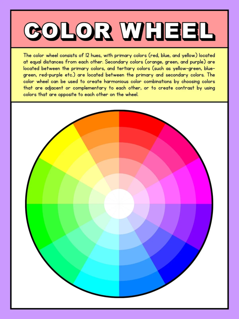
In cannabis marketing, your color scheme isn’t just a design choice—it’s a strategic decision. Colors create emotion, build recognition, and instantly tell your audience what kind of brand you are.
Take BCNA’s palette:
- Black background
- Gold lettering
- Neon green cannabis leaf
This combo is bold, grounded, and unmistakably cannabis-forward.
When building your brand visuals—logo, website, or ad copy—here’s what to keep in mind:
Strong color pairings:
- Gold with charcoal or forest green for a premium look
- Green with white or cream for a fresh, organic feel
- Black with neon accents for contrast and energy
Colors to avoid together:
- Red and green (can be hard to read and visually jarring)
- Multiple bright tones competing for attention
- Dark-on-dark combinations that blend and lose impact
Print tip:
What looks great on screen doesn’t always translate well to print. A dark green background with dark or gold lettering may look rich online—but in print, it can turn muddy and unreadable.
- For magazine ads or news articles, stick with a clean white background and crisp, high-contrast text.
- Use color as an accent, not the foundation, so your message is easy to read.
Your audience won’t engage if they have to squint. Make every word count—clearly.
Need help fine-tuning your brand’s color strategy? Let’s connect. BestCopyNow.com.
YouTube Video Short – https://youtube.com/shorts/GfddJv8s7HE?feature=share
#CannabisBranding #ColorStrategy #DispensaryMarketing #CannabisDesign #BestCopyNow

